Exponential Moving Average (EMA) Explained

As we said in the previous lesson, simple moving averages can be distorted by spikes. We’ll start with an example.
Let’s say we plot a 5-period SMA on the daily chart of EUR/USD.
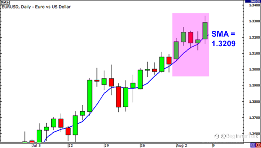
The closing prices for the last 5 days are as follows:
Day 1: 1.3172
Day 2: 1.3231
Day 3: 1.3164
Day 4: 1.3186
Day 5: 1.3293
The simple moving average would be calculated as follows:
(1.3172 + 1.3231 + 1.3164 + 1.3186 + 1.3293) / 5 = 1.3209
Simple enough, right?
Well, what if there was a news report on Day 2 that causes the euro to drop across the board.This causes EUR/USD to plunge and close at 1.3000. Let’s see what effect this would have on the 5-period SMA.
Day 1: 1.3172
Day 2: 1.3000
Day 3: 1.3164
Day 4: 1.3186
Day 5: 1.3293
The simple moving average would be calculated as follows:
(1.3172 + 1.3000 + 1.3164 + 1.3186 + 1.3293) / 5 = 1.3163
The result of the simple moving average would be a lot lower and it would give you the notion that the price was actually going down when in reality, Day 2 was just a one-time event caused by the poor results of an economic report.
The point we’re trying to make is that sometimes the simple moving average might be too simple.If only there was a way that you could filter out these spikes so that you wouldn’t get the wrong idea.
Hmm… Wait a minute… Yep, there is a way!
It’s called the Exponential Moving Average!
Exponential moving averages (EMA) give more weight to the most recent periods.
In our example above, the EMA would put more weight on the prices of the most recent days, which would be Days 3, 4, and 5.This would mean that the spike on Day 2 would be of lesser value and wouldn’t have as big an effect on the moving average as it would if we had calculated for a simple moving average.
If you think about it, this makes a lot of sense because what this does is it puts more emphasis on what traders are doing recently.
Exponential Moving Average (EMA) vs. Simple Moving Average (SMA)
Let’s take a look at the 4-hour chart of USD/JPY to highlight how a simple moving average (SMA) and exponential moving average (EMA) would look side by side on a chart.
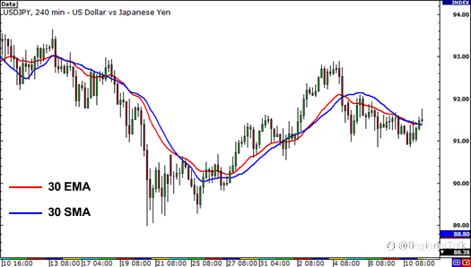
Notice how the red line (the 30 EMA) seems to be a closer price than the blue line (the 30 SMA).
This means that it more accurately represents recent price action. You can probably guess why this happens.
It’s because the exponential moving average places more emphasis on what has been happening lately.
When trading, it is far more important to see what traders are doing NOW rather than what they were doing last week or last month.
Reprinted from Babypips,the copyright all reserved by the original author.
Disclaimer: The content above represents only the views of the author or guest. It does not represent any views or positions of FOLLOWME and does not mean that FOLLOWME agrees with its statement or description, nor does it constitute any investment advice. For all actions taken by visitors based on information provided by the FOLLOWME community, the community does not assume any form of liability unless otherwise expressly promised in writing.
FOLLOWME Trading Community Website: https://www.followme.com


Hot
No comment on record. Start new comment.