Using Fibonacci Retracements to Analyse

The Dot-com Bubble
Below you’ll find an image of the Nasdaq 100 at the weekly time frame. It depicts the price action at the height of the dot-com bubble and the crash that followed. As you can see, following the lows it set in May, the market attempted to rebound and was rejected twice from the 50% retracement, and twice from the 61.8% level, only to break down to lower-lows. It would take 14 years for it to cross those levels again.
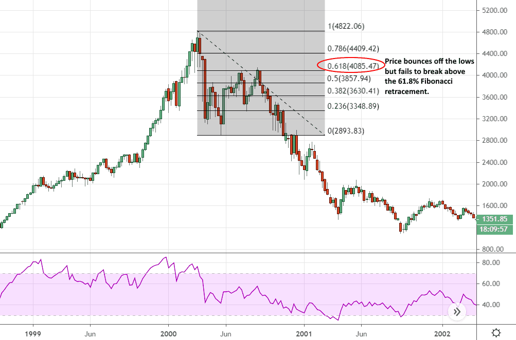
Nasdaq 100 at the weekly time frame 1999-2002
The Crash of 1929
The following image is of the Dow Jones Industrial Average, again at the weekly time frame. It describes the price action in the run-up to the stock market crash of 1929, followed by the attempted bounce, and the prolonged fall in asset prices during the Great Depression. In this case, we have a more pronounced drop, as well as what looks like the beginning of a V-shaped recovery that stalls in April of 1930, barely managing to break above the 50% Fibonacci retracement. The V shapes that we’re currently seeing in many equities markets across the globe (excluding the US, which has bounced much harder) are reminiscent of the bounce below.
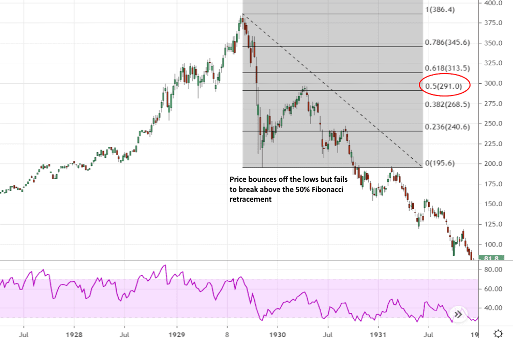
Dow Jones Industrial Average at the weekly time frame 1928-1932
The Chinese Stock Market Bubble (2006-2008)
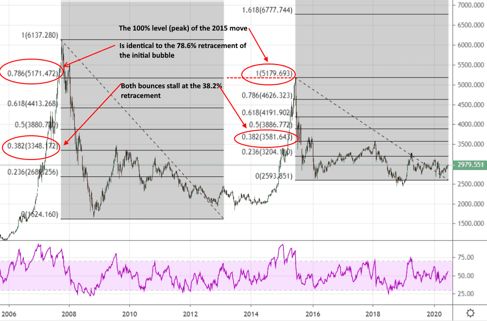
Next, we move on to the Shanghai Composite Index and the bubble it experienced between 2006 and 2008. As you can see, after the crash the price made a lacklustre attempt at a recovery and, again, we have what looks like the beginnings of a V-formation; however, it loses steam and is rejected from the 38.2% Fibonacci level. What’s interesting about this chart is that after things settled down post-2008, we got what looked like a smaller version of the initial bubble with similar results. Fibonacci retracements sometimes nestle neatly into each other when plotted at different time frames or on subsequent moves. In this case, the peak of the 2015 move (i.e. 100%) is at exactly the same level as the 78.6% level from the first retracement we plotted for the 2006-2008 bubble.
The Bitcoin Bubble of 2017
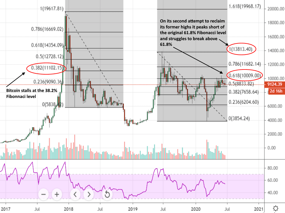
In many ways, Bitcoin’s meteoric rise and fall between 2017 and 2019 is the mother of all bubbles. This is because it was the perfect combination of a new type of asset (reminiscent of tulip mania), a very short run-up (less than a year), and a truly epic run that minted a large number of new millionaires (more than 2000% in a single year). When you plot Fibonacci retracements onto the 2017 bubble, as well as the second move up we saw in 2019, you start to see some interesting parallels with the previous chart of the Shanghai Composite Index.
Similar to the previous chart, after hitting its lows of February 2018, Bitcoin rebounds but barely makes it above the 38.2% retracement. This is followed by a series of lower-highs that carry on well into 2019. The second peak in 2019 is rejected from roughly the 61.8% retracement level of the initial bubble which is at, or around, $14,000. Just as in the above chart, the price attempts to reclaim former highs, but falls short, creating a smaller version of the first pattern.
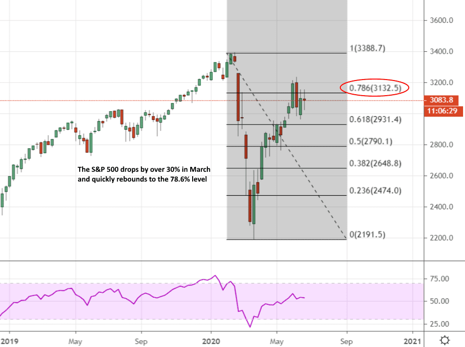
Where We Are Today
As you can see from the following chart of the S&P 500, there’s quite a difference between the price action we’ve looked at above and the current state of US stock markets. The difference is not due to the magnitudes of the bounces as you may think; it’s the lack of data to go on. This is one of the hardest things to get right when you’re looking at a pattern that’s only just started forming. You try to apply well-known historical patterns to a situation that is only just starting to develop.
After looking at the chart below, go back to the image of the Shanghai Composite Index, then to the Bitcoin bubble of 2017. In both situations, the price briefly dipped before the crash got properly underway and then came back to re-test the 78.6% level. In both cases, the price briefly broke above it only to dip back down again. The point is, that the chart below may be pointing to just the opening moves of a much more protracted move down. Alternatively, it may just be a minor blip on the way to new highs as we saw in 1987, and as it currently looks with the NASDAQ. We just don’t know because we simply don't have enough data to go on. All of the above charts describe moves that took place over a number of years; all we currently have are a few months of trading data.
The Psychology of Bubbles
If you think about the charts we’ve looked at throughout this article, they have very little in common; different assets, different countries, different periods in history. The reason that Fibonacci retracements seem to reveal an eerie consistency to the way that all these different charts behave, is that all of them are determined by the actions and emotions of human beings. The above bubbles were all, in their own ways, inflated and popped due to human sentiment going from euphoria through complacency, to anxiety, denial and panic. The above bubbles also have another feature in common; they were all exacerbated by a retail mania in which inexperienced investors were jumping in at the wrong time believing that it was their ticket to great riches.
What we’ve been witnessing in US markets over the course of the past few years isn’t quite the same thing. The excesses of the previous year or so have had very little to do with the retail crowd. There has not been a sense of blind over-exuberance that tends to characterise the inflation of bubbles; in fact, quite the opposite. Many of us have been sitting on the sidelines, scratching our heads, waiting for the tide to go out and being surprised when this hasn’t occurred. Most of the flows, which have been very well publicised, have come from share buybacks and pension funds.
It was only during the pandemic and subsequent lockdown that we saw a huge number of retail traders rushing in to buy the dip. The point is, if we are seeing a bubble forming here, it could have much further to run. What this means is that we are only just getting started and the recent shake-ups we saw in March will take many months - probably well into next year - to begin to resemble any sort of recognisable shape on the charts.
Disclaimer: The content above represents only the views of the author or guest. It does not represent any views or positions of FOLLOWME and does not mean that FOLLOWME agrees with its statement or description, nor does it constitute any investment advice. For all actions taken by visitors based on information provided by the FOLLOWME community, the community does not assume any form of liability unless otherwise expressly promised in writing.
FOLLOWME Trading Community Website: https://www.followme.com


Hot
No comment on record. Start new comment.